


Lies, Damned Lies, & Statistics
Never the Twain or three should meet ...


As all three of those categories seem rather prevalent in the “debate” over sex and gender, gender in particular, it seems useful to at least review the rudiments of the more tractable of those three, i.e., statistics itself. Unfortunately, much of the topic is rather “counter-intuitive” at best and many people’s eyes glaze over, quite understandably, when one even mentions the term and related ones like “mean”, “average”, and “standard deviation”.
And that is even more so when one tries to compare various population distributions that are characterized by and which illustrate those terms. All of which is unfortunate, particularly for socially important groups like men and women, since understanding those terms and the differences in the populations they refer to seems to be a necessary precursor to dealing with and resolving various thorny social problems.
Consequently, I’ve written a rudimentary program – links below – which people can download and “fiddle with” — can “kick the tires” of — so as to understand those terms and how they’re related, and how they might apply to various issues, gender and “gender non-conforming” in particular. To run the program it will be necessary to install something roughly equivalent to the Adobe Acrobat Reader, though it is the “Computable Document Format” (CDF) Reader from Wolfram – but a fairly simple and more or less painless process to install. One will then need to download the actual program, which I have now posted to Google Drive, although I’m not 100% certain about that process, and then open it with the Reader.
First off is to understand the steps one normally follows in characterizing or describing particular populations as a precursor to comparing different ones. Generally speaking, many populations show significant differences in any given trait – men and women in particular, although other populations likewise. But differences in heights between men and women are one of the more useful traits to use, particularly for purposes of illustration, and that largely because height is easy to measure, it is not at all subjective, and because men are, on average, some 10 centimeters (4 inches) taller than women.
Given that, one then takes a “sample population” – 500 men and 500 women in the example illustrated – and then measures how many individuals in each group have heights in any given interval. The program uses intervals of 5 centimeters (cm.) or about 2 inches (in.); for reference, an average woman’s height is 165 cm. or 65 in. while an average man’s height is 175 cm., or 69 in. Finally, one takes all of those counts and puts them into a graph that summarizes that information.
For example, the following illustrates the program and the Reader as well as providing a portion of a table of height intervals and the number of women who are found to have heights within each range:
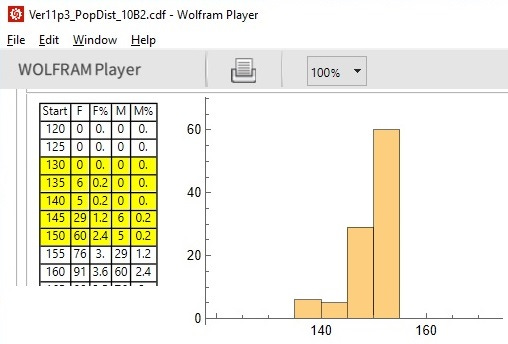
As illustrated above, of the 500 hundred women who were “sampled”, it is found that 60 have heights between 150 and 155 cm. And which is then illustrated by a graph of women’s heights in centimeters on the horizontal axis (in 5 cm. steps) versus the count on the vertical axis. Adjacent to the counts in the “F” column is the percentage of the population — in each interval — for every cm. of height. For example, 60 women in a 5 cm. interval means 12 women, on average, in each 1 cm. interval which works out to 12*100/500 = 2.4% of the population is each cm. of height. The benefit of using percentages is that one can readily compare different populations even if the population sizes are substantially different.
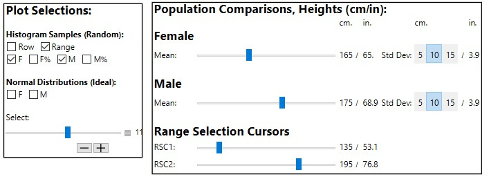
As a procedural aside, different sections of the both populations can be selected by first selecting the “Row” in the controls section below, moving the “Select” slider as required, then selecting “Range” followed by moving the “Select” slider, using the -/+ step button, to plot different portions of the entire population:
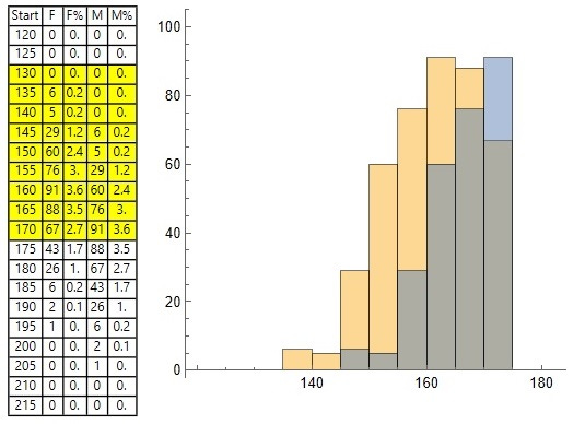
For reference purposes, here is a portion of the data and graphs for both men and women, although the counts — i.e., bar heights — for men and women are superimposed on each other and are not easily interpreted – orange for women, blue for men, and grey for the overlaps:
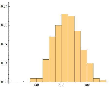
And for reference purposes, here is the entire population of just females plotted with the percentage per cm. in each interval:
Now that we have the rudiments of both procedure and data under our belts, it is now appropriate to consider the abstractions and conclusions that follow from them. Basically, many traits in many populations – from people to plants to products coming off production lines – all show the same type of traits, measurements, and characteristics – the infamous “normal distribution”. The data that I “acquired” in those two samples for men and women were produced by a more or less random sampling driven by the program, although I “fudged” things a bit by forcing the samples to be identical and repetitive. But that is unlikely in “the real world” as most such samples will show significant variations, the fewer the larger the sample.
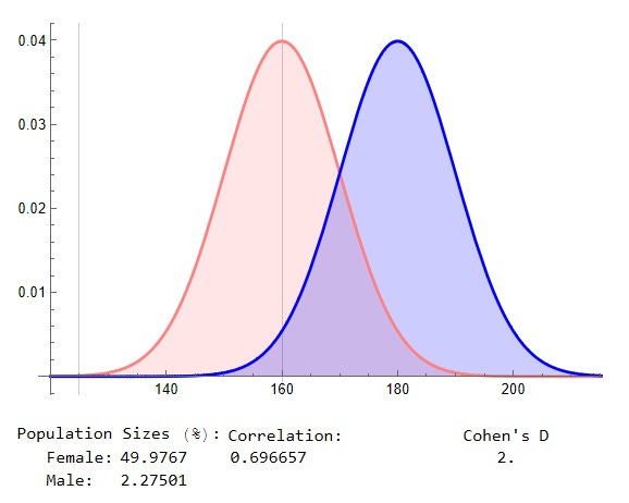
However, because of that commonality and for many or large samples, their graphs will closely approximate a fairly simple, and more useful, equation that relates the average or mean – the most common measurement – and the “spread” or distribution of all of the samples. For example, here are the theoretical plots for both women and men with the averages (means) selected as 165 and 175 cm with the “standard deviation” for both selected to be 10 cm.:

The “nature of the beast”, the nature of that equation, is that some 99.7% of the entire population will be found within 3 standard deviations – 30 cm. (12 in.) – either side of the average or mean. For example, note that the two cursors on and to the left of the mean for women cover 49.87 % of the entire population. Note also that at the peak – at the mean of 165 cm. – there is 4% or 0.04 of the population in each 1 cm. of range which falls off either side to zero at 3 standard deviations.
Note too that adjusting the two cursors allows one to compare how much of each population — what percentage of the total — is between them. For example, in the above graph, there is 15% of the male population between those two markers, who are between 135 and 165 cm. in height.
However, one might ask, “well, all of that is fine and dandy, but of what use is it?” Good question — Caroline Criado Perez, for example, reasonably answers that “Crash-test dummies based on the ‘average’ male are just one example of design that forgets about women – and puts lives at risk”. But it’s not just physiological differences that show important degrees of “sexual dimorphism”. There’s a great deal of evidence, even if some of it may be debatable or of questionable value, that there are many equally large differences in personalities and behaviours — in a word, in “gender”.
But for example, see this generally very good essay over at 4thWave Now which provides this illuminating illustration:
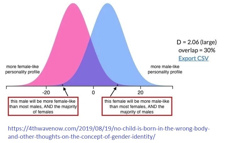
Of particular note is their emphasis that, particularly for cases where there is a wide separation between the means — twice the standard deviation in the above case, a Cohen’s D of 2.0 — there are going to be significant numbers of males and females who have personality traits that are atypical, that they are “gender non-conforming”. Using the Wolfram program to get a precise measurement (below), we might say that some 2.3% of males are going to have traits that are as “feminine” as those exhibited by 50% of females:
Similarly, that program allows one to get a handle on an apparently common misperception. Many people seem to think that the 30% overlap between the two curves in that case — the darker blue section in the middle — means that, for example, some 70% of women will have traits, or values for them, that no male has:
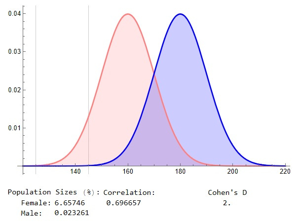
However, as indicated, only some 6.7% of females will have trait values — heights below 145 cm — that only very few males will exhibit, about 2 in 10,000.
Clearly, population distributions, and the statistical measurements that follow from them, are of significant value. However, they can also be misused by intent or carelessness.
Unfortunately, most people haven't the first clue how to read and interpret statistics, while researchers and reporters are masters of 'smoke and mirrors.'
Love your Russian translation below- "the spirit is willing but the flesh is weak" -- into "the wine is fine but the meat is bad"- kind of says it all.
Math - you’ve got to love it! And you’ve got to make sure it isn’t mis-used. Your essay explains and celebrates statistics while warning how easily they can be distorted or misleading. Kudos to you.